Mingsheng Aluminum Sheet Home > faq > Aluminum Alloy > Shape And Color Of Traffic Sign Design
Shape And Color Of Traffic Sign Design
Author:Aluminum Sheeting for Trailers_Aluminum Trailer Siding Sheets_Mingsheng Aluminum Update time:2025-04-06 08:23:01Traffic sign design is to determine its geometric features (shape, size), layout information (pattern or text), color, reflective lighting, border (edging), placement position, installation form (support structure, installation height) and selection of variable message signs according to the characteristics of the road and traffic, the purpose of the sign setup.
Here, the main focus will be on the shape, size, color, layout information, border and placement of the signage.
Other design elements such as reflectivity, illumination, variable message signs and sign post supports will be covered later, and you may also refer to the Manual on Uniform Traffic Control Facilities published by the Federal Highway Administration.
The basic requirement regarding the design of traffic signs is that they must be readable and easily understood in a timely manner so that road users can respond appropriately.
To this end, traffic sign design should ensure that traffic signs are highly visible and easy to read.
That is to say, whether during the day or at night, traffic signs are easy to see; and its character or pattern size is reasonable, the length of the text message is appropriate to ensure that traveling road users can see and understand in a timely manner.
In short, it is very important to ensure that traffic signs are concise and uniform in design, location and application.
Uniformity in the design of traffic signs includes the shape, color, size, layout information, border and illuminated reflections of traffic signs.
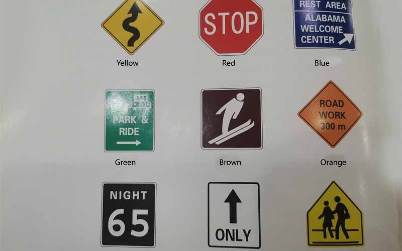
For different road traffic signs, the Manual on Uniform Traffic Control Devices (MUTCD) specifies their shapes and colors so that they can be quickly identified by road users.
Some shapes are specifically chosen for certain types of traffic signs, such as octagons for “stop” signs, equilateral triangles for “yield” signs, and circles for highway-railroad crossings.
The U.S. Federal Highway Administration's Manual on Uniform Traffic Control Devices (MUTCD) specifies the use of traffic sign shapes.
With the exception of “stop” signs, all traffic signs should have guide corners.
In addition, each traffic sign shall have a border approximately 12.7 mm in from the sign edge.
The color of the border shall be consistent with the color of the sign's layout information (graphics, text, etc.).
| Shapes | Signs |
| Octagon | Stop (sign) |
| Equilateral triangle | Give way |
| Circle | Highway-railway crossing (pre-warning) or emergency evacuation route signs |
| Pendant/Isosceles triangle (laying flat) | No overtaking |
| Pentagon | Student crossing or county road signs |
| Cross | Highway-railway crossing |
| Rhombus | Warning |
| Rectangle | Prohibition, directions, warning information |
| Trapezoid | Tourism and entertainment information |

The Manual on Uniform Traffic Control Devices also specifies special colors for different traffic signs.
Note that when white is used as a color, it also includes silver coatings that reflect white light, etc.
See the Manual on Uniform Traffic Control Facilities for standard sizes of traffic sign signage.
If other sizes are used, use engineering judgment.
However, signage dimensions should not be smaller than the minimum dimensions specified in the Manual on Uniform Traffic Control Facilities.
If the signage size is to be increased for readability, do so in 6in increments.
For text messages on traffic signs, use the specified words and characters.
Text messages are to be simple and clear, with the text laid out in a logical manner, avoiding the use of abbreviations wherever possible.
The size of the characters should be sufficient to ensure the necessary readable distance, and a reasonable ratio of character height to readable distance is 25mm/12m.
Usually, characters should be capitalized, only city street names and numbers can be lowercase, but the first letter should be capitalized.
In general, graphics are not as well understood as text, and when patterns are to be used, the standard patterns specified in the Manual on Uniform Traffic Control Devices are to be used.
The use of any new pattern requires the approval of the Federal Highway Administration.
All graphics are oriented to the left, with the exception of reflectorized signs, which are oriented the opposite way.
Article Categories
New Article
Contact Us
Contact:Maddy
Add:No. 162 Jinbai Road, Zhengzhou City, Henan Province, China
